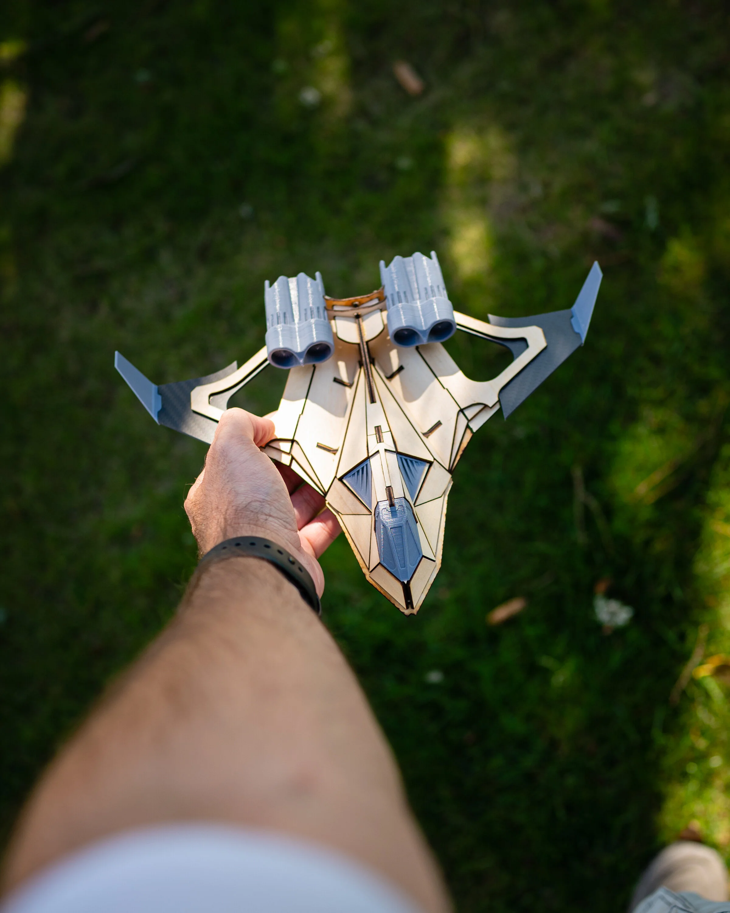
September and October are going to be big months for AeroMaiden. I’ve started the process of building the first set of prototypes for the Classic Quad. As I showed in my last update, the first prototype (Proto 1) was a success and showed the design to be easy to assemble. However upon reflection I wanted to make a number of changes, both for aesthetics as well as ease of assembly.

Aesthetically, the updates were relatively minor. A pair of intakes were added to the front as well as minor wood sizing tweaks. The quad engine setup was also condensed into a double dual setup. Fewer parts and better looking. I also cleaned up the leading wing edge so no carbon fiber pokes out.

The wing supports were greatly improved and the water plume stand looks fantastic!

Now that the Proto 2 model is done, I’m very happy with the state of the project. At this point I have several branching paths I need to pursue in order to bring this to market.

The biggest and most time consuming activity of late has been the art direction. As sole curator, it’s a daunting hill to climb when you realize your traditional art skills are not good enough. As much as I would like to use traditional style artwork in my branding and advertising, commissioning the art would quickly get prohibitively expensive.

As such, I’ve been looking into stylized “low cost” alternatives to my original desires. Having a copy of Keyshot as well as Photoshop for rendering and edits has provided me with some interesting results to consider.

It’s a weird problem to address. Having a model works great for creating digital rendered content… however it’s a model of a model. If I want my packaging to represent the actual fictional ship, I would ideally create a model of same ship. So far that solution is prohibitively expensive on a time front. So creating stylized art of the “model of a model” blurs the line just enough to give me what I’m looking for. At very little cost to AM.

So far I haven’t found anything I’m truly happy with. However I feel like I’m quite a bit closer than I use to be.
One of the biggest changes I’m exploring is changing the “artwork” to an instruction booklet. Degrade my box to a simple box with a single color logo and put a ton of effort into an instruction booklet. Let it be the first thing you see when you open the box. Make it high quality… something not to throw away. Hell I might even include a little bookstand with the model for it.
Outside of packaging artwork, the livery is being done by a friend of mine. Hopefully the next time you hear from me I will have that livery tested on Proto 3! I’m trying to set a goal of having the kickstarter live by the end of November. Next monthly update should have me on the final stretch to Kickstarter and then Decembers update should be a “We are live! Oh crap I still got so much left to do!”